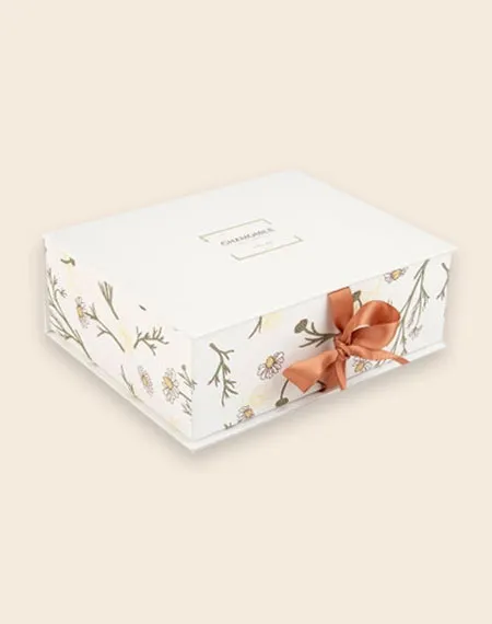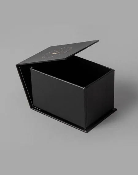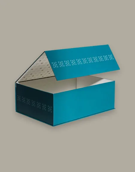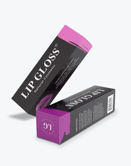


Select dimensions in cm, mm, inches, ml, or oz and more — whatever fits your product.

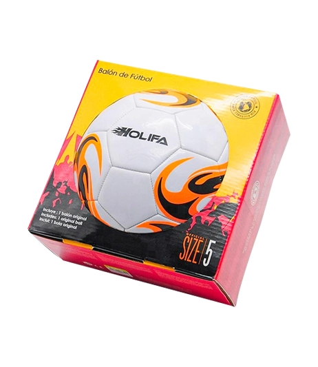
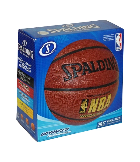
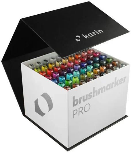
Printing and color shape how customers recognize a package before they open it. At Custom Boxes Inc., digital and offset printing, CMYK, PMS/spot colors, and selected metallic or white-ink directions can be considered according to the artwork, material, structure, and project requirements. We connect the color plan to the real box panels, folds, seams, and opening areas through artwork checks, dieline support, and digital proofs. Whether the design is restrained or highly visual, every printed element should have a clear role. Share your logo, brand colors, artwork, box style, quantity, and intended presentation so the print specification can be developed as part of the complete packaging project.

Select dimensions in cm, mm, inches, ml, or oz and more — whatever fits your product.

Choose the Stock, printing type, and enter your order quantity.

Upload your ready artwork — or just write “Need Design” and we'll handle it.

Fill in your name, contact number, and email for quick communication.

Solve a quick captcha and hit “Submit Quote” — it takes seconds!

Our expert will reach out ASAP with the best market rate from a top packaging provider.

After You Approve the Quote — Here's What Happens Next


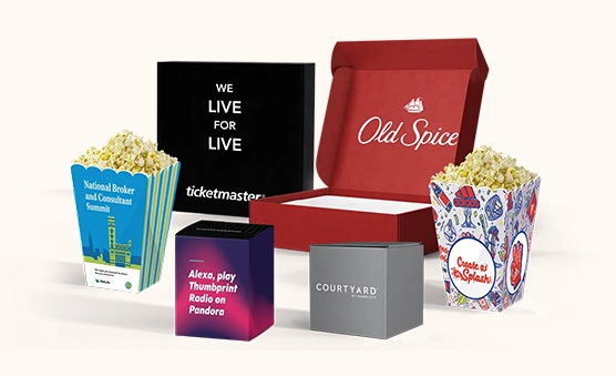
Printing gives a custom box its visible brand language. Color, typography, illustration, product information, and panel placement all contribute to how the package is understood before it opens. A useful print plan begins with the artwork and the real box structure, then considers the material, quantity, finishing details, and intended presentation together. At Custom Boxes Inc., digital and offset printing, CMYK, PMS/spot colors, and selected metallic or white-ink directions can be discussed according to the project. The aim is to choose a coordinated approach that serves the brand and product instead of selecting a print method or color system in isolation.
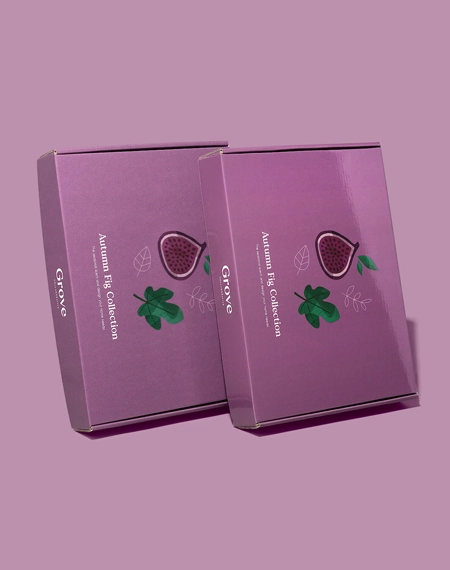
Start by identifying what customers should notice first. That may be the brand name, product name, variant, a central image, or a concise point of distinction. Assign those elements a clear hierarchy before adding secondary copy or decorative details. A strong visual order helps the front panel lead while the side, top, back, and selected inside panels support the same message. The intended setting should influence this hierarchy. Retail packaging may need the main product information to read clearly from the front or side. A mailer may place more emphasis on the lid and opening sequence. A rigid presentation box can use exterior and interior printing as part of the reveal. Thinking through the customer moment gives each printed surface a purpose and keeps the artwork connected to how the package will actually be viewed.
Digital and offset printing are available directions for custom packaging projects. The appropriate choice depends on factors such as the artwork, quantity, material, box structure, desired color treatment, and overall specification. Rather than choosing a process from its name alone, share the complete brief so the printing discussion reflects the package being produced. Complex artwork, restrained typography, repeating patterns, and illustration-led designs may each raise different questions. The size of printed areas, number of panels, and relationship between colors also matter. By reviewing the artwork alongside the box style and material, the packaging team can discuss which available process aligns with the project. This approach keeps printing tied to the intended outcome instead of making it a separate technical decision.
CMYK and PMS/spot color options provide different ways to plan a packaging color system. CMYK may be considered for designs that use several colors, photographic elements, illustrations, or tonal transitions. PMS or spot colors may be considered when a defined brand color or controlled area of color is part of the artwork. Some projects may call for one direction, while others may combine approaches according to the design and production plan. Color should be reviewed in relation to the chosen material. A design prepared for a light paperboard surface will not have the same visual context as artwork placed on kraft or a selected rigid-box wrap. This does not mean one surface is automatically better; it means the material is part of the color decision. Share brand references and note which colors are central to recognition so the print brief clearly separates essential brand elements from flexible supporting tones.
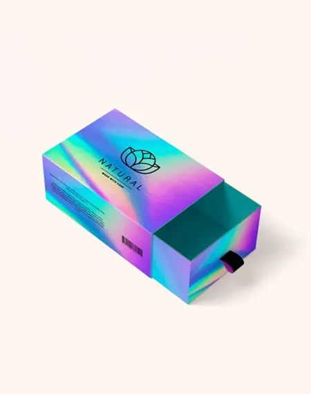
White ink may be considered for appropriate projects when stronger contrast or a defined light element is needed, including selected kraft packaging designs. It can support typography, logos, illustrations, or controlled areas according to the artwork and material. Metallic ink may also be considered where the project calls for a metallic printed accent. These directions should be reviewed as part of the complete design rather than added after the panel layout is finished. Use specialty ink with a specific visual role. A short mark, border, title, or illustration detail may provide a clearer point of emphasis than applying it everywhere. The material, surrounding colors, and any finishing choices should remain part of the discussion. This helps the specialty treatment feel integrated into the packaging rather than disconnected from the rest of the brand system.
A box is a three-dimensional object, so packaging artwork cannot be planned only as a front-facing rectangle. The dieline maps the panels, folds, seams, closures, and opening areas that shape the printed layout. It allows the design team to see where graphics continue, where text needs space, and how the composition changes as the box is assembled and opened. Place the main message on the panel most likely to lead in the intended setting. Use supporting panels for product details, patterns, instructions, or a short brand story. Keep important copy and logos clear of folds, seams, and closure areas. An artwork check can identify layout concerns, while a digital proof gives the team an opportunity to review the proposed panel arrangement before production moves forward.
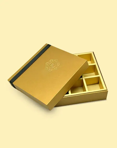
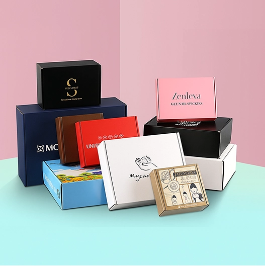
Paperboard, cardstock, kraft, corrugated material, rigid greyboard wraps, and other paper-based directions each create a different visual setting for printed artwork. The material should therefore be selected early enough to influence the color and design conversation. Box style also matters because a folding carton, mailer, display box, or rigid structure presents its panels in different ways. Finishes can add another layer of emphasis. Matte, gloss, soft-touch, and aqueous coatings may be considered according to the project, while foil stamping, embossing, debossing, spot UV, and raised effects can highlight controlled areas of the design. These choices should support the print hierarchy rather than compete with it. Reviewing material, ink, finish, and panel layout together produces a more coherent packaging brief.
A repeatable color and artwork system can help related packages feel connected even when dimensions, structures, or materials change. Keep key logo treatments, approved color references, typography, and graphic rules organized across the product range. Then allow product names, variants, illustrations, or supporting colors to distinguish individual packages. Approved dielines, artwork files, and proof details can provide useful references for future projects. They help new variations begin from an established direction while still allowing the print plan to adapt to another box size, material, or structure. Consistency is strongest when it is documented as a system rather than recreated from memory for each order.
Include the box style, dimensions, material direction, quantity, intended use, artwork files, logo, brand color references, and desired finishing details when requesting guidance. Explain which panels matter most and whether the package will be displayed, shipped, gifted, or opened as part of a presentation. If the artwork is still in development, identify the required content and the visual direction you want to explore.
Verified feedback from real packaging buyers.


Answers to Help You Order with Confidence
The appropriate process depends on your artwork, quantity, material, box structure, desired color treatment, and overall specification. Share the complete project brief so the available printing methods can be considered in relation to the actual packaging.
CMYK may be considered for multicolor artwork, photographic elements, illustrations, and tonal transitions. PMS or spot colors may suit projects where a defined brand color or controlled color area is central to the design.
White and metallic ink can be considered for appropriate materials, artwork, and packaging projects. White ink may be useful for selected kraft designs, while metallic ink can introduce a controlled metallic printed accent.
Paperboard, kraft, corrugated material, and rigid-box wraps create different visual settings for printed artwork. Reviewing material, color, and finishes together helps establish a more informed print direction before production.
Include the box style, dimensions, material, quantity, artwork files, logo, brand-color references, intended use, and desired finishes. Explain which panels are most important and whether you require artwork or dieline assistance.
Custom Boxes Inc is a leading manufacturer and supplier of custom packaging boxes tailored for every product and industry. From startups to global brands, we empower businesses across the USA with cost-effective, high-quality, fully personalized packaging solutions — crafted with precision, delivered with speed. Whether you need eco-friendly cardboard boxes, rigid luxury boxes, or branded retail-ready display packaging — we've got you covered with endless customization options, low MOQs, and lightning-fast turnarounds.